How to create responsive cards
Posted on April 18, 2021, 8 p.m. by Bishal ( 4200)
Hi Everyone, Code With Bishal is back with a new project. So grab your PC and open your favourite Code Editor and start coding with me. In this blog, we will create responsive column cards which will enhance the UI/UX of your website. Continue reading this blog to take a demo of the column cards. All the downloadable resources are attached to this blog, You can easily download these with the help of the buttons below.
What is a Responsive card?
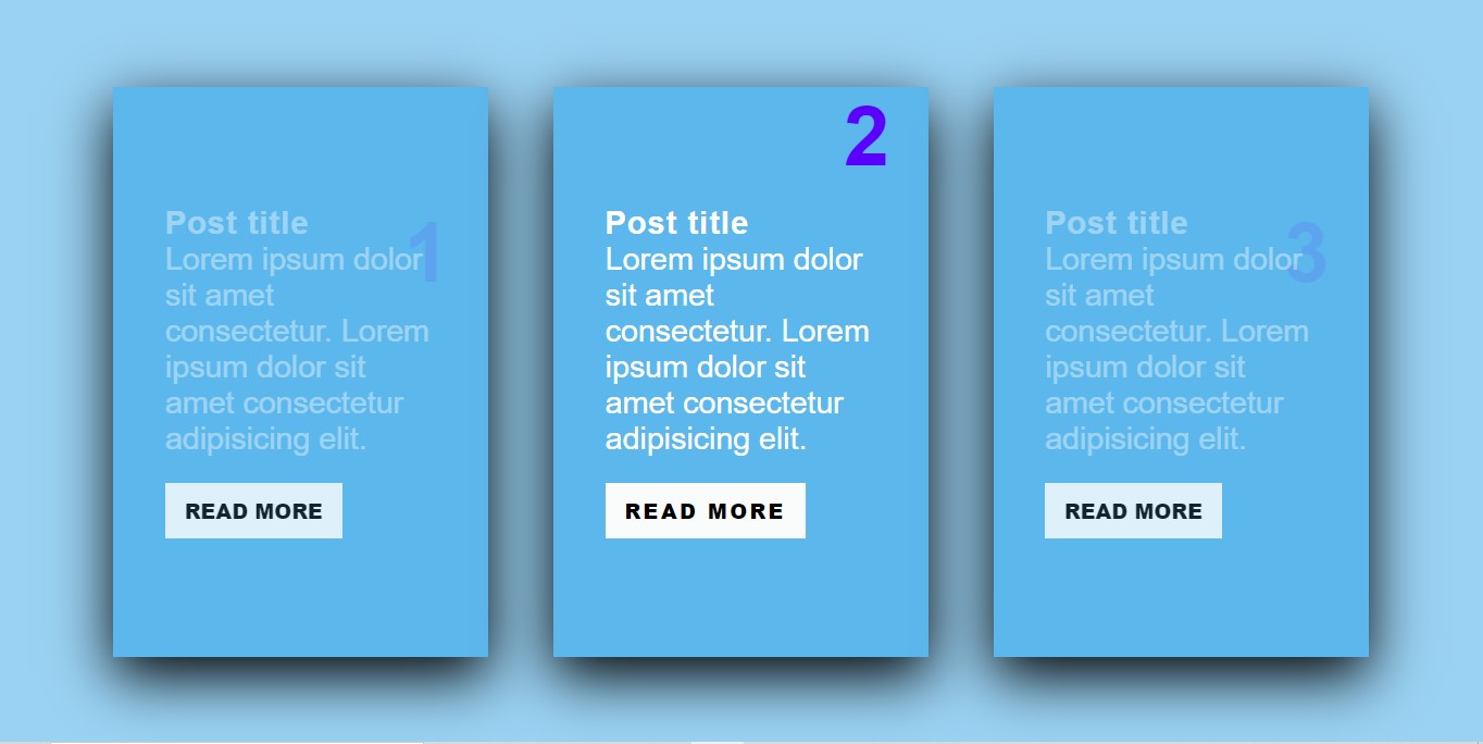
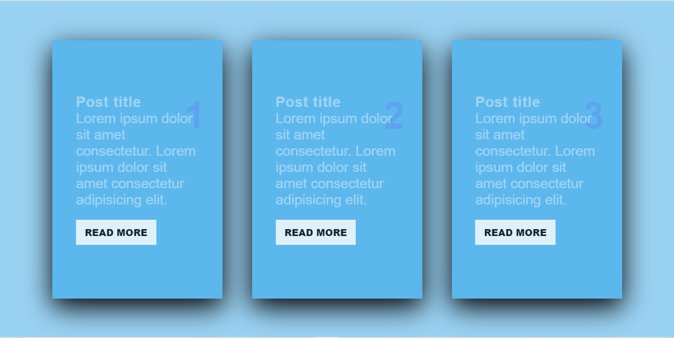
Our awesome, Responsive card gives visitors an attractive Responsive card that can be used to show blog posts.
How can I use this Responsive card using CSS?
You can easily copy the code or can download the code from our website and can simply paste it anywhere to get the Responsive card.
Do I need to know how to code?
No, you don't need to know how to code you can simply copy code from here and paste it wherever you want your Responsive card. Also, you can try it on our website using the "TRY IT NOW" option or can download the code using the "Download" button below.
What are the advantages of the Responsive card?
Responsive card is a very good way for showing blog posts that can be easily viewed on mobile as well as on PC.
How can I download the source code of the Responsive card?
Scroll the page to the bottom there you will find our download button to download the code.
Some Screenshots
Step by step guide of creating responsive column cards using HTML and CSS:
-
Create a file with the name
index.html -
Open
index.html -
Add the Broiler plate of HTML
Broiler Plate of HTML:
<!DOCTYPE html>
<html>
<head>
<title>Responsive cards - Code With Bishal</title>
</head>
<!-- created by Code With Bishal - www.codewithbishal.com
-->
<body>
</body>
</html>
-
Create a file
style.css -
Link External CSS file with your HTML file
Here is how can you link:
Add these code in the <head> </head> of your HTML document:
<link href="style.css" rel="stylesheet">
Now add some CSS code to the style.css file:
*{
margin: 0px;
padding: 0px;
box-sizing: border-box;
font-family: 'Poppins', sans-serif;
}
-
then add below code to align the cards to the center
body{
display: flex;
justify-content: center;
align-items: center;
background:#ffffff9d;
min-height: 100vh;
}
.container{
width: 1000vh;
display: flex;
justify-content: center;
align-items: center;
flex-wrap: wrap;
}
-
Then add this code to style the cards
.container .column-cards{
position: relative;
width: 290px;
height: 440px;
background: #5cb7ec;
display: flex;
justify-content: center;
align-items: center;
margin: 25px;
box-shadow: 0 15px 45px black;
}
.container .column-cards .column-content{
padding: 40px;
align-items: center;
justify-content: center;
}
.container .column-cards .column-content h2{
position: absolute;
right: 30px;
font-size: 4em;
font-weight: 700;
color: rgb(89, 0, 255);
z-index: 1;
opacity: 0.1;
transition: 500ms;
}
-
Then add some hover effect
.container .column-cards:hover .column-content h2{
opacity: 1;
transform: translateY(-70px);
}
-
Then add style to the contents of the card
.container .column-cards .column-content h3{
position: relative;
font-size: 1.5em;
color: white;
z-index: 2;
opacity: 0.4;
letter-spacing: 1px;
transition: 500ms;
}
.container .column-cards .column-content p{
position: relative;
justify-content: center;
align-self: center;
font-size: 1.5em;
color: white;
z-index: 2;
font-weight: 200;
opacity: 0.4;
transition: 500ms;
}
-
Then add some more hover effect
.container .column-cards:hover .column-content h3, .container .column-cards:hover .column-content p{
opacity: 1;
}
.container .column-cards:hover a{
opacity: 1;
letter-spacing: 2px;
transition: 1000ms;
background: rgb(250, 252, 252);
}
-
Then add style to the link (Button)
a{
display: inline-block;
margin-top: 20px;
padding: 10px 15px;
color: black;
opacity: 0.8;
background: white;
text-decoration: none;
text-transform: uppercase;
font-weight: 900;
}
Source Code
1) HTML Code:
<!DOCTYPE html>
<html>
<head>
<title>Responsive cards - Code With Bishal</title>
</head>
<!-- created by Code With Bishal - www.codewithbishal.com
-->
<body>
<div class="container">
<div class="column-cards">
<div class="column-content">
<h2>1</h2>
<h3>Post title</h3>
<p>Lorem ipsum dolor sit amet consectetur. Lorem ipsum dolor sit amet consectetur adipisicing elit.</p>
<a href="#">Read More</a>
</div>
</div>
<div class="column-cards">
<div class="column-content">
<h2>2</h2>
<h3>Post title</h3>
<p>Lorem ipsum dolor sit amet consectetur. Lorem ipsum dolor sit amet consectetur adipisicing elit.</p>
<a href="#">Read More</a>
</div>
</div>
<div class="column-cards">
<div class="column-content">
<h2>3</h2>
<h3>Post title</h3>
<p>Lorem ipsum dolor sit amet consectetur. Lorem ipsum dolor sit amet consectetur adipisicing elit.</p>
<a href="#">Read More</a>
</div>
</div>
</div>
</body>

</html>
2) CSS Code:
@import url('https://fonts.googleapis.com/css2?family=Poppins:wght@500&display=swap');
*{
margin: 0px;
padding: 0px;
box-sizing: border-box;
font-family: 'Poppins', sans-serif;
}
body{
display: flex;
justify-content: center;
align-items: center;
background:#ffffff9d;
min-height: 100vh;
}
.container{
width: 1000vh;
display: flex;
justify-content: center;
align-items: center;
flex-wrap: wrap;
}
.container .column-cards{
position: relative;
width: 290px;
height: 440px;
background: #5cb7ec;
display: flex;
justify-content: center;
align-items: center;
margin: 25px;
box-shadow: 0 15px 45px black;
}
.container .column-cards .column-content{
padding: 40px;
align-items: center;
justify-content: center;
}
.container .column-cards .column-content h2{
position: absolute;
right: 30px;
font-size: 4em;
font-weight: 700;
color: rgb(89, 0, 255);
z-index: 1;
opacity: 0.1;
transition: 500ms;
}
.container .column-cards:hover .column-content h2{
opacity: 1;
transform: translateY(-70px);
}
.container .column-cards .column-content h3{
position: relative;
font-size: 1.5em;
color: white;
z-index: 2;
opacity: 0.4;
letter-spacing: 1px;
transition: 500ms;
}
.container .column-cards .column-content p{
position: relative;
justify-content: center;
align-self: center;
font-size: 1.5em;
color: white;
z-index: 2;
font-weight: 200;
opacity: 0.4;
transition: 500ms;
}
.container .column-cards:hover .column-content h3, .container .column-cards:hover .column-content p{
opacity: 1;
}
a{
display: inline-block;
margin-top: 20px;
padding: 10px 15px;
color: black;
opacity: 0.8;
background: white;
text-decoration: none;
text-transform: uppercase;
font-weight: 900;
}
.container .column-cards:hover a{
opacity: 1;
letter-spacing: 2px;
transition: 1000ms;
background: rgb(250, 252, 252);
}