How To Create glowing button CSS Effect
Posted on April 9, 2021, 8 p.m. by Bishal ( 13578)
Hi Everyone, Code With Bishal is back with a new project. So grab your PC and open your favourite Code Editor and start coding with me. In this blog, we will make a simple glowing button using HTML and CSS. Continue reading this blog to take a demo of the glowing button. All the downloadable resources are attached to this blog, You can easily download these with the help of the buttons below.
What is a glowing button(CSS effect)?
Our awesome, glowing button(CSS effect) gives visitors an attractive button that glows on hover.
How can I use this glowing button(CSS effect)?
You can easily copy the code from our website and can simply paste it anywhere on your website.
Do I need to know how to code?
No, you don't need to know how to code you can simply copy code from here and paste it wherever you want your contact form. Also, you can try it on our website using the "TRY IT NOW" option or can download the post using the "Download" button below.
How can I download the source code?
Scroll the page to the bottom there you will find the download button to download the code.
In this blog, you can learn, how to make a Glowing Button using HTML and CSS By Code With Bishal. Just Copy The Code From Here And Paste It Into Your Website. If you are having any problem viewing the code just refresh the page. Glowing Button is a lightweight and easy-to-use HTML and CSS code that creates a Glowing button for you. In this blog, there are five sections on the webpage, in the first section, you can get a preview of the blog, in the second section there are few FAQs and an overview of the blog, in the third section there are few more coding blogs you might like, in the fourth section you can Try our Glowing Button using the "TRY IT NOW" button, after that, you can copy the code and paste it [that's the fifth section] and from the last section You can download the source code.
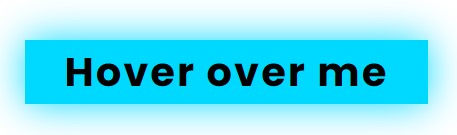
Some ScreenShots:
Demo
Hover over me
Step by step guide for creating the glowing button:
-
Create a file with the name
index.html -
Open
index.html -
Add the Broiler plate of HTML
Broiler Plate of HTML
<!DOCTYPE html>
<html>
<head>
<title>Glowing Button - Code With Bishal</title>
</head>
<!-- created by Code With Bishal - www.codewithbishal.com
-->
<body>
</body>
</html>
-
Now, inside the body, we will add the
buttonelement to create a button.
<button class="glowing-button">Hover over me</button>
OR
If you want to add a hyperlink use this code :
<a href="#" class="glowing-button">Hover over me</a>
-
Create a file
style.css -
Link External CSS file with your HTML file
Here is how can you link:
Add these code in the <head> </head> of your HTML document:
<link href="style.css" rel="stylesheet">
Now add some CSS code to the style.css file:
.container {
margin-top: 25%;
display: flex;
justify-content: center;
align-items: center;
}
.glowing-button{
padding: 20px 40px;
border: 3px; /* change this to change the border color and thickness */
font-weight: 700;
text-decoration: none;
letter-spacing: 2px; /* change this to change the spacing between the letters*/
color: black; /* change this to change font-color */
font-size: 40px; /*change this to change font size */
}
.glowing-button:hover{
animation: glow 1500ms infinite; /* change this to change the color of text after hover over the button */
}
@keyframes glow {
0% { background-color: #0ad2e0; box-shadow: 0 0 3px #0ad2e0; }
50% { background-color: #00d9ff; box-shadow: 0 0 40px #00d9ff; }
100% { background-color: #0a9fda; box-shadow: 0 0 3px #0a9fda; }
}
Source Code
1) HTML Code:
<!DOCTYPE html>
<html>
<head>
<title>Glowing Button - Code With Bishal</title>
</head>
<!-- created by Code With Bishal - www.codewithbishal.com
-->
<body>
<div class="container">
<a href="#" class="glowing-button">Hover over me</a>
</div>
</body>
</html>
2) CSS Code:
.container {
margin-top: 25%;
display: flex;
justify-content: center;
align-items: center;
}
.glowing-button{
padding: 20px 40px;
border: 3px; /* change this to change the border color and thickness */
font-weight: 700;
text-decoration: none;
letter-spacing: 2px; /* change this to change the spacing between the letters*/
color: black; /* change this to change font-color */
font-size: 40px; /*change this to change font size */
}
.glowing-button:hover{
animation: glow 1500ms infinite; /* change this to change the color of text after hover over the button */
}
@keyframes glow {
0% { background-color: #0ad2e0; box-shadow: 0 0 3px #0ad2e0; }
50% { background-color: #00d9ff; box-shadow: 0 0 40px #00d9ff; }
100% { background-color: #0a9fda; box-shadow: 0 0 3px #0a9fda; }
}